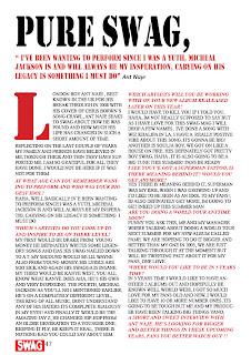
For my Double page spread I decided to copy the following image, I copied ths image becuase it was simple and I thought that it would link in well with the design of my other two pages. I used a black and white image of Anthony which I edited myself, I opened it into Indesign and used the rectangle frame tool and placed my image within the box, then fitting it to frame. On the left hand page is my interview which I had prepared with Anthony, I used the Font stencil to get a simalur style title, I also used the colour red to give it that clear link.
The image below is the double page spread which I decided to link mine too:
My interview with Anthony i wrote down notes and exapanded on them in my interview, Anthony actually records his own music but not to the level that we talk about. I took loads of my own images of them recording and just having fun so that it gives a range of images, some serious, some fun.
This link shows my images for the Double Page Spread,
http://www.flickr.com/photos/61217461@N07/sets/72157626397447874/
my double page spread...


No comments:
Post a Comment