Thursday, 31 March 2011

How does your media product represent particular social groups?

For my Front Cover design I focused on representing the genre of hip-hop. Hip-hop is definately more of an American social group but is rapidly moving over to the UK. Soulja Boy and 50 Cent who feature on the Front Cover of XXL are big American hip-hop artists and often rap about the word "swag" which basically means the way you dress and your attitude, for example Soulja Boy has a well known song called "turn my swag on". My hip-hop magazine is based on this word "swag" as I used it for my title and thought that it would definately attract the particular social group I was aiming for.

The image below shows how I tried to incorporate the hip-hop style into my own magazine,


As you can see I asked my models Anthony and Ali to pose in basically the exact same pose as 50 Cent and Soulja Boy. I asked Anthony and Ali to pose with a serious look to pull of the whole hip-hop style, you can also see that I dressed them in similar outfits to fit the mise-en-scene, for example I drew a Superman tattoo on Anthony to show the link between him and Soulja Boy, tattoos are becoming a big craze in America and within the hip-hop stereotype. As you can see Anthony is wearing a red NY flat cap which is also part of the hip-hop stereotype, many males and females wear NY flat caps, for example the image below.


These NY hats are brought and personalised by some American hip-hop artists, as you can see there are plenty of designs and colours to choose from. I decided to include the hat in my image because I believe it gave it more of a hip-hop stereotype, I was going the image without the hat but in the end I thought the image with the hat gave my front cover that extra something. Here is the two images below..


I brought some gold necklaces from Primark to add to the hip-hop stereotype, I got my ideas of what the hip-hop stereotype looked like, by watching music videos on YouTube and searching artists such as Soulja Boy on google. Below is an image that helped to inspire the overall look along side the XXL front cover.

As you can see in the image above Soulja Boy has tattoos and flat cap and bling. I focused on these three things for my mise-en-scene and hopefully pulled it off.

Throughout my whole magazine I kept to the same stereotype, for my Contents page I had to copy the American hip-hop artist Nicki Minaj who is also very well known at the moment. She has recently been worldwide and her number of fans is constantly increasing. I asked my friend Natasha to copy a few different Nicki Minaj poses which we found online so that she could get into the role. Here's a few examples...


This image I did not use for my contents page as it didn't show a clear link at all, these images where literally to experiment with different poses giving me a wider range of images to choose from.
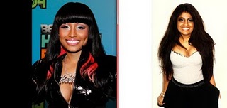

I personally thought that my model had a similar look to Nicki Minaj and fitted the part very well, this image was also not used for my front cover design but was just to show the different experiments I tried out.


This image above is to show that to create the whole female hip-hop stereotype I searched on YouTube a Nicki Minaj styled makeup video and followed it step by step to create this look. I did the makeup myself, using different eyeshadows and fake eyelashes. This represents the female side of hip-hop and how the makeup is very over the top and heavy.

The image below is a picture of the contents page I copied and my copy. As you can see I dressed my model in a similar outfit again and have her posing with the same sort of attitude.


I personally think that my hip-hop magazine "SWAG" represents young adults from around about teens to early 20s as the image on my front cover depicts two young men, one with a cap on, tattoos and some "bling" and the other a tank top and some "bling" and this style is very popular among hip-hop/rap fans. It also represents people who are and have been part of hip-hop culture meaning they follow the music, lifestyle and fashion of this genre..


In what ways does your product use, develop or challenge forms and conventions of real media products?

For my music magazine "SWAG" I used a large amount of conventions of a real magazine called "XXL" because i wanted to make my magazine as realistic as I could. I added a barcode to the bottom left hand corner, I did this by cropping to original XXL barcode and then saving it as a jpeg, I then made a box in Indesign using the rectangle frame tool and placed the barcode within it, I did this to make my magazine look even more realistic. I got all my ideas from the magazine "XXL" to get the professional look, XXL magazine also helped me to convey the conventions of the hip-hop genre, which was the genre I choose for my music magazine.

The image below shows my image that I choose to use for my Front Cover,


As I said earlier, I do not think I challenged any forms and conventions, my Front Cover image is quite similar to the XXL one, I drew on the Superman tattoo on Anthony to give it that extra link between images, I also brought a long some necklaces which could be used as "bling" showing another link between both images. As you can see the model on the left is wearing a cap which is a popular style that a lot of hip-hop artists use. The light in the top right corner I managed to remove in Photoshop by using a stamp tool.

The reason I choose to copy this XXL front cover is because it looks simple, tidy and modern. I kept my models in the left third of the magazine so that I could easily fit in my mast head SWAG and the headlines going down on the left hand side. The image below shows my link between my masthead SWAG and XXL.


As you can see I kept my Font very similar but gave it a unique twist, again I don't believe I challenged any forms and conventions concerning the masthead or any of my Front Cover Design, I basically kept my Front Cover simple like XXL but I added some little unique twists, such as different fonts and adding different props within my main Front Cover image.

This an image of my Front Cover Design,


For my Contents page I think I may have challenged the conventions of a hip-hop magazine because this genre of music is mainly seen as masculine and for my Contents page I used a female model taking on the role of a new hip-hop artist Nicki Minaj as you can see in the image below.


Wednesday, 30 March 2011

Secondary Research

What genre of music are you going to use?

The genre of music I am going to use is hip-hop, hip-hop music has developed as a part of hip-hop culture and first began in South Bronx of New York City around the 1970's. Hip-hop is easily related to rap, rap is more of a vocal style in which the Artists lyrically rhyme to a synthetic beat, the hip-hop culture has grown and grown across not only America but the World and influences a lot of people. The reason hip-hop is so successful is because the lyrics to a synthetic beat are usually about past experiences that many people can relate too, making it deep and personal to the listener. Hip-hop is not only seen as a culture but it influences the way many people across the world today, hip-hop could be seen as not only real music but as a fashion today.


What media currently exists for this genre?

Many media's today exist for this genre (hip-hop), for example many hip-hop artists are played on the following music channels, MTV, Chanel AKA, Starz, Flava etc... It can also be shown in many magazines like Hip-Hop, STASH, XXL and Giant. Hip-Hop is regularly on the radio as well and shown through medias that we don't even notice, there are many concerts and gigs that are advertised which shows hip-hop through the media.

The image below is the Front Cover i have decided to copy...


To recreate this cover of the magazine i would change the masthead from XXL and to SWAG with a similar font to keep the same style, i also want my models to be wearing lots of bling to link with the hip-hop stereotype and linking to the masthead SWAG.                                                                                                                                                                                                                                                                                                                                                                                                                                                                                                                                                                                                                                                                                                                                                                                                                                                                                                                                                                                                                                                                                                                                                                                                                                                                                                                                                                                                                                                                                


Friday, 26 November 2010

Front Cover and Contents page of My Student Magazine


    The two images above are my final designs of the front cover and contents page of my student magazine. To create these two final images I used the programs photo shop to edit my photographs and adobe in design to create the front cover we did this in a total of 3 weeks.

       Personally my use of colour is quite bland and not as effective as what I would have liked, it looks quite washed out. I think that the front cover image is positioned in the right place because I followed the rule of thirds, the image is also relevant to the magazine. My choice of font for the masthead is okay but not what i would have ideally liked. My headlines on the front cover are also relevant to the genre of the magazine which makes the magazine, the different fonts and colours make them stand out and catch the attention of readers, I wanted the headlines too make the magazine look less boring. My use of the gradient on the front cover works and makes the front cover look more professional.

     My contents page seems a little bland especially the colour scheme, my fonts are the same as the front cover and look a little untidy, my images on the contents page link to the headlines and i labelled the pages of which you could find them to make it clear for the reader and so they can find things quicker.